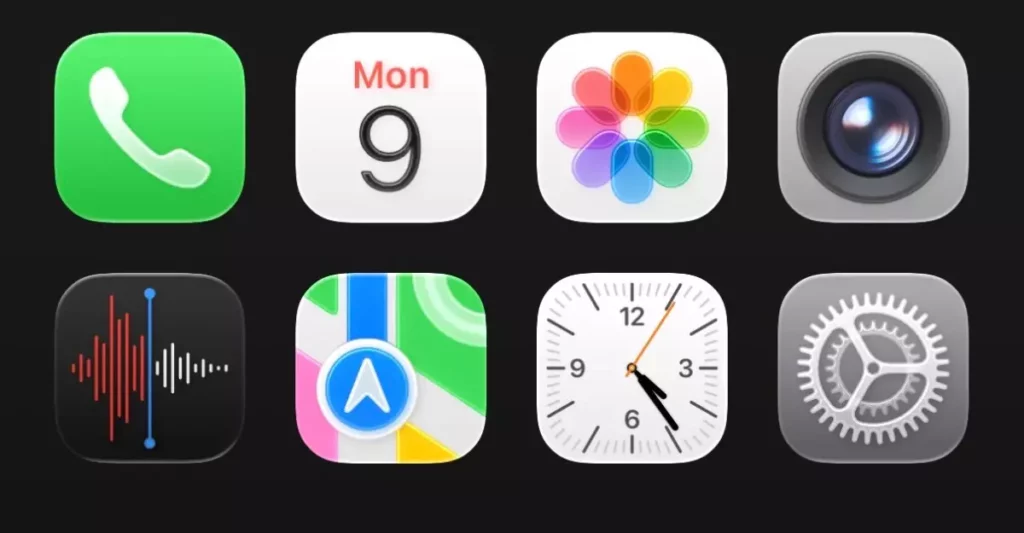
Apple’s recent reveal of the Liquid Glass design at WWDC 2025 has ignited discussions that oscillate between fascination and doubt. While the high-gloss, semi-translucent aesthetics may resonate with minimalist chic, they simultaneously raise alarming concerns about practicality. When form overtakes function, one has to question whether this design is a genuine innovation or simply a superficial trend masquerading as progress. The glamour of the visuals is undeniable, yet there’s an unsettling feeling that usability is the collateral damage in this quest for modernity.
When you first interact with a device featuring this new look, you might find the aesthetic overwhelming, almost gaudy. The app icons seem more like ornamental features than necessary tools. Each tap feels like navigating an art exhibit rather than a functional device. This shift from simplicity to visual complexity casts a shadow on the user experience. It begs the question: At what point does artistic ambition become an impediment to functionality? The very essence of Apple has been ease of use, a stronghold that now feels compromised under the weight of its own visual flair.
Clutter vs. Clarity: A Dangerous Trade-off
One of the most glaring drawbacks of the Liquid Glass interface is the clutter that emerges where clarity once stood proud. Features like the Control Center now resemble a jumbled mess, overwhelming users who previously appreciated the streamlined efficiency of iOS. What was once a cohesive operating system appears fragmented under this new design philosophy, making one wonder if beauty has overshadowed usability. Users who have come to rely on the intuitive nature of previous iterations may find themselves stymied by the sheer chaos presented by the Liquid Glass interface.
Moreover, the inherent attempt at transparency poses a unique dilemma. Important toggles and options, vital to a user’s everyday experience, often blend into the backdrop, obscured by the very design meant to enhance visual experience. This begs an urgent question: Is Apple prioritizing its aesthetics at the risk of user functionality? For a brand that has distinguished itself by marrying style with efficiency, this design choice appears riddled with contradictions, perhaps indicating a serious miscalculation on the tech giant’s part.
Eye-Catching Anomalies: Distracting “Innovations”
Delving deeper into the Liquid Glass aesthetic, we encounter several curious design anomalies that strain the boundary between innovation and distraction. For instance, the rounded bottom tab bar intends to engage users more deeply, but often it ends up contributing to the visual chaos. Instead of guiding users smoothly, these elements add layers of confusion and clutter. One has to question if Apple is gambling on eye-catching embellishments at the expense of immediate functional understanding.
It’s worth noting that the animative features, such as water droplet-like transitions, are drenched in artistic ambition but may not hold their charm in daily use. In a fast-paced digital world driven by efficiency, these adornments risk becoming tiresome rather than transformative. The premise of innovation here seems to lean towards theatrics rather than meaningful enhancements. Have we traded genuine user satisfaction for the allure of eye candy?
Ambitious Yet Flawed: The User Feedback Trap
As early adopters dive into the beta version of iOS 26, feedback is pouring in, unveiling the stark realities of this ambitious design approach. Users are clamoring for a return to fundamental usability, urging Apple to rethink its current priorities. The juxtaposition of art and practicality is not merely a point of discussion; it has become a pressing necessity. Apple’s storied commitment to attention to detail stands at a crossroads—will it remain true to its foundational ethos or chase after an elusive design ideal?
At this juncture, one cannot help but feel that Apple is teetering on the edge of profound misjudgment. Striding forward into a bold future, the company must recognize that innovation isn’t simply about adopting a new visual language but also about enriching the user experience. The success of the Liquid Glass design may hinge on its capacity to incorporate user feedback into its aesthetic ethos.
A Call for Balance in Design Philosophy
For Apple, navigating this new territory requires careful calibration between artistic vision and user practicality. As the world watches, there’s an expectation that the company will not only innovate but will do so in a manner that respects the fundamental relationship between people and technology. The potential for Liquid Glass to thrive exists, but only if Apple can find the balance between vaunted beauty and everyday usability—a balance that, when disregarded, could lead to a misstep of monumental proportions in the company’s storied history.


Leave a Reply